BackSA
BankSA has backed South Australians for over 150 years. It’s #1 small business lender, financed 1 in 3 homes and backed more agribusinesses than any other bank. We had to remind South Australia that BankSA was more than just a bank and would always put the state first.
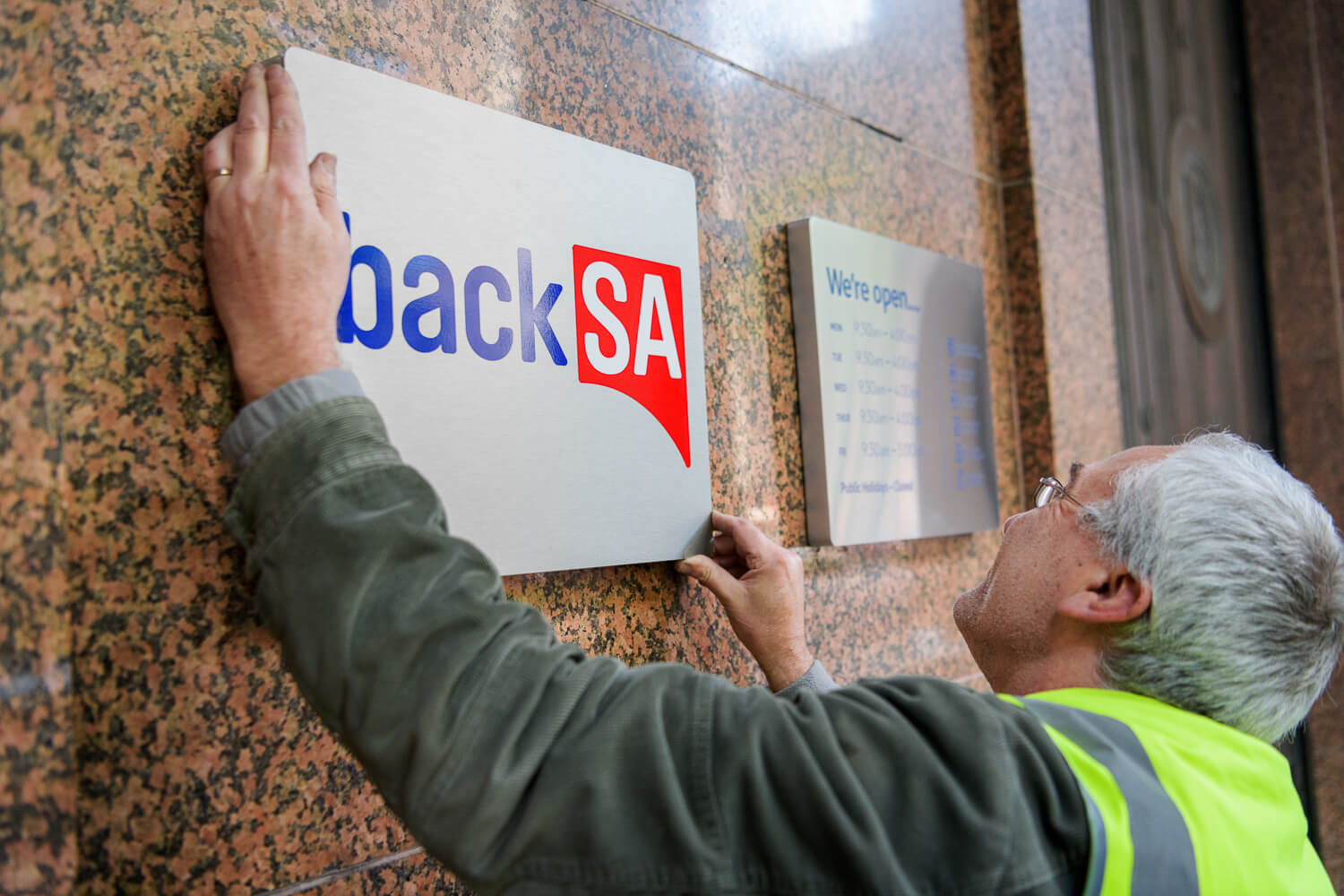
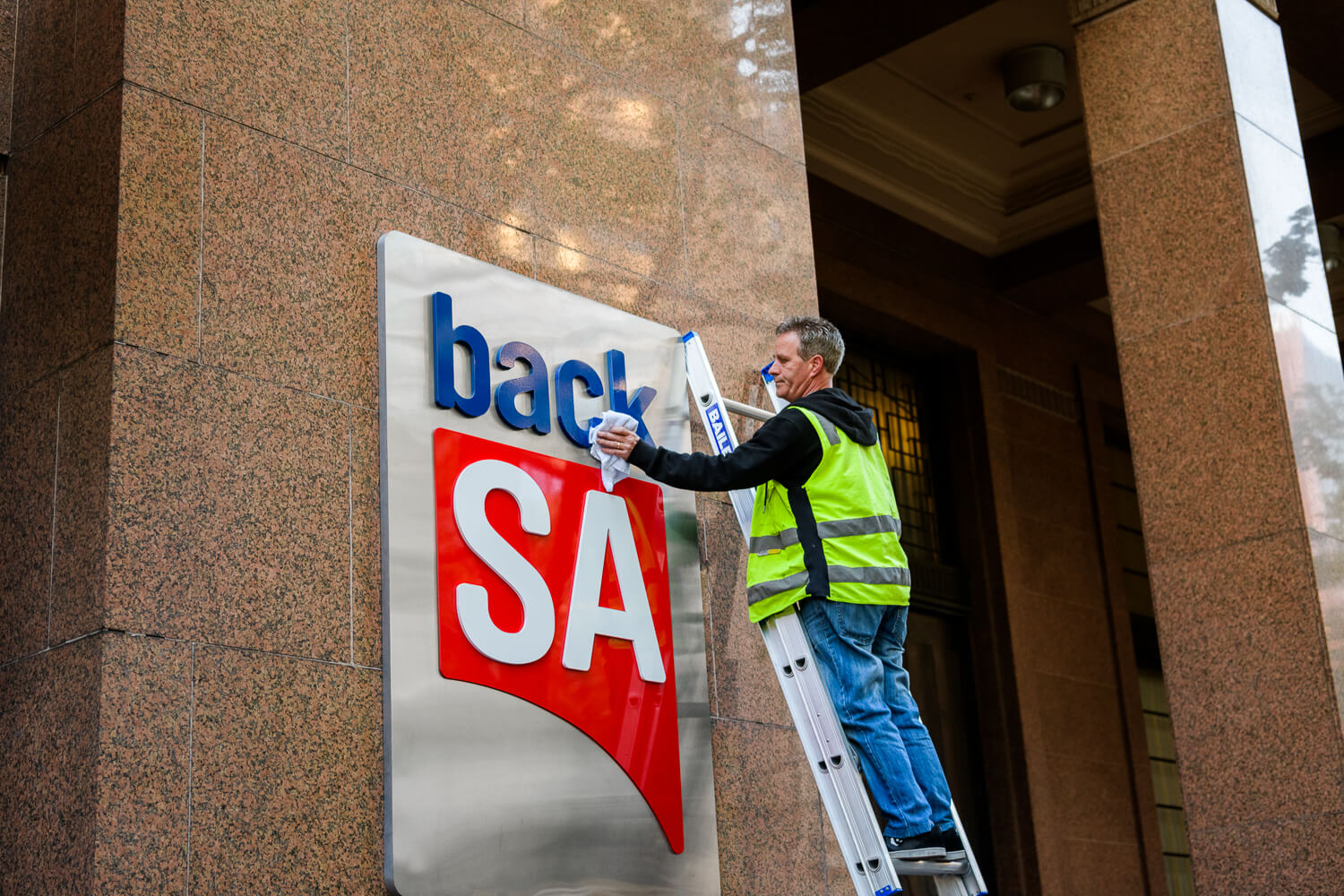
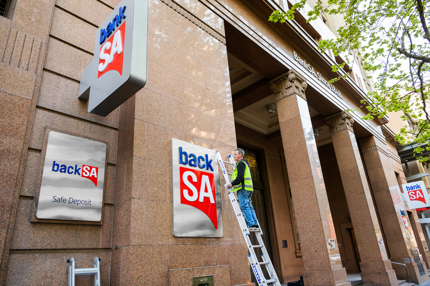
In a time where the word ‘bank’ is dirty word (royal commission…cough), we changed one letter. We became backSA. But it had to be more than a name change. To show the state we meant business, we put our new name on the outside of one of the most iconic buildings in the state – the bankSA head office.
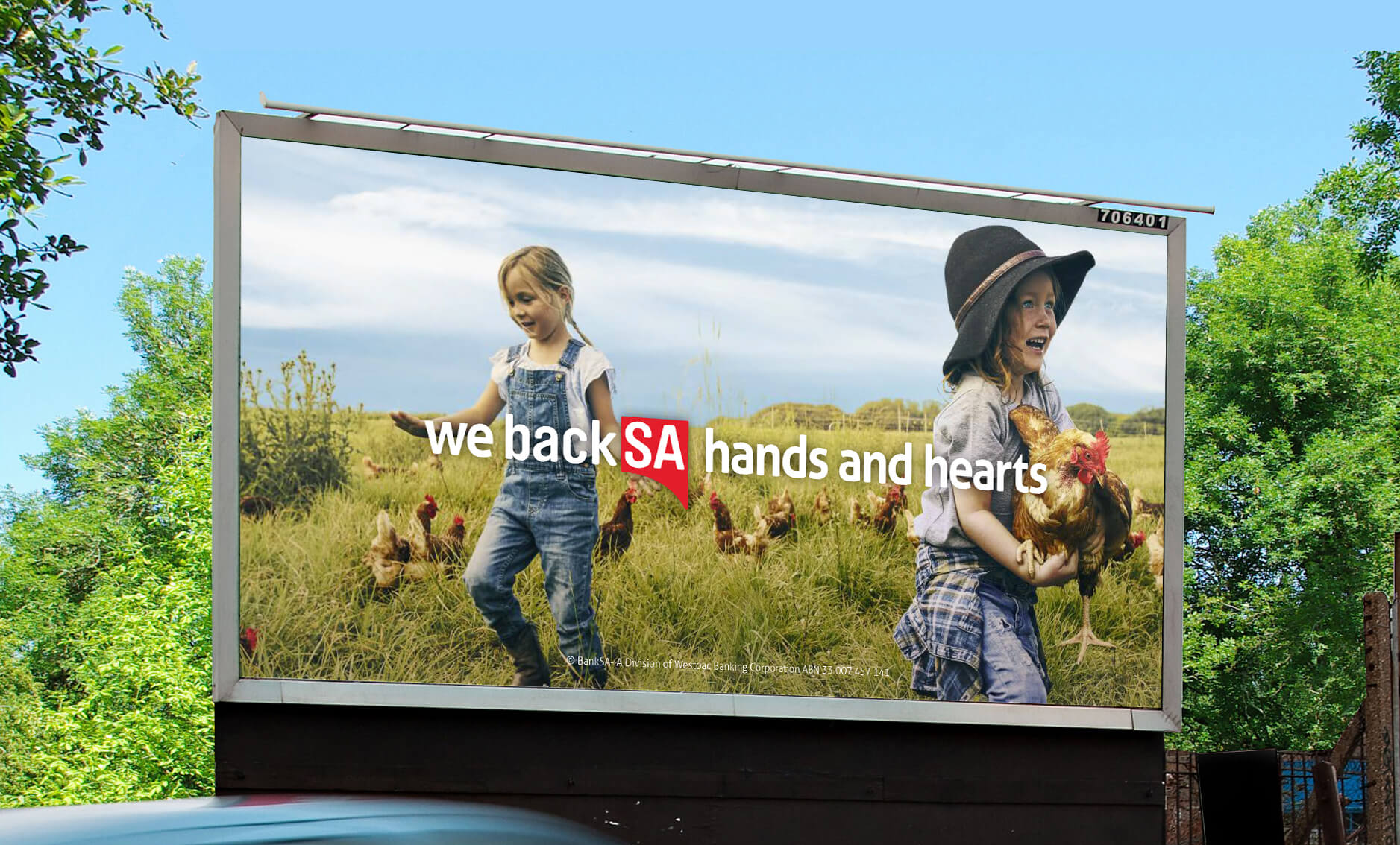
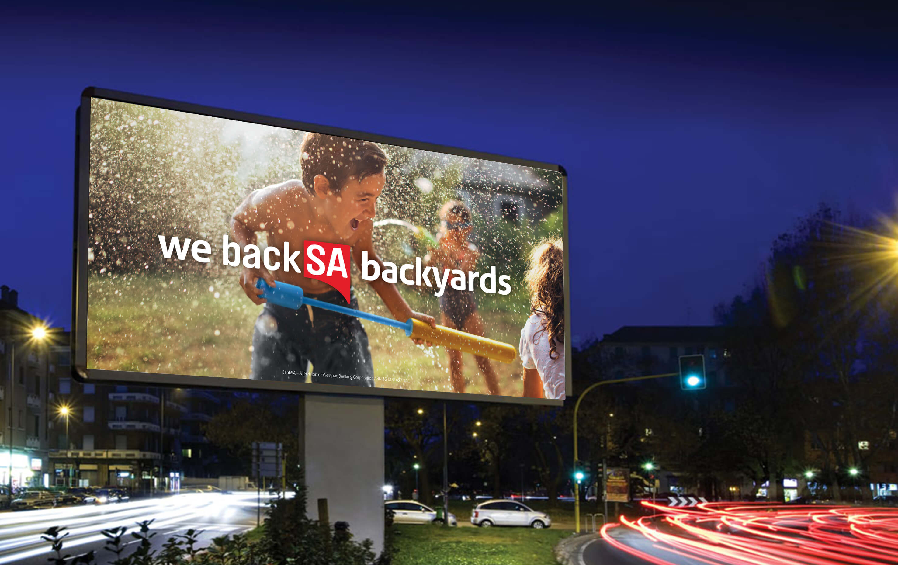
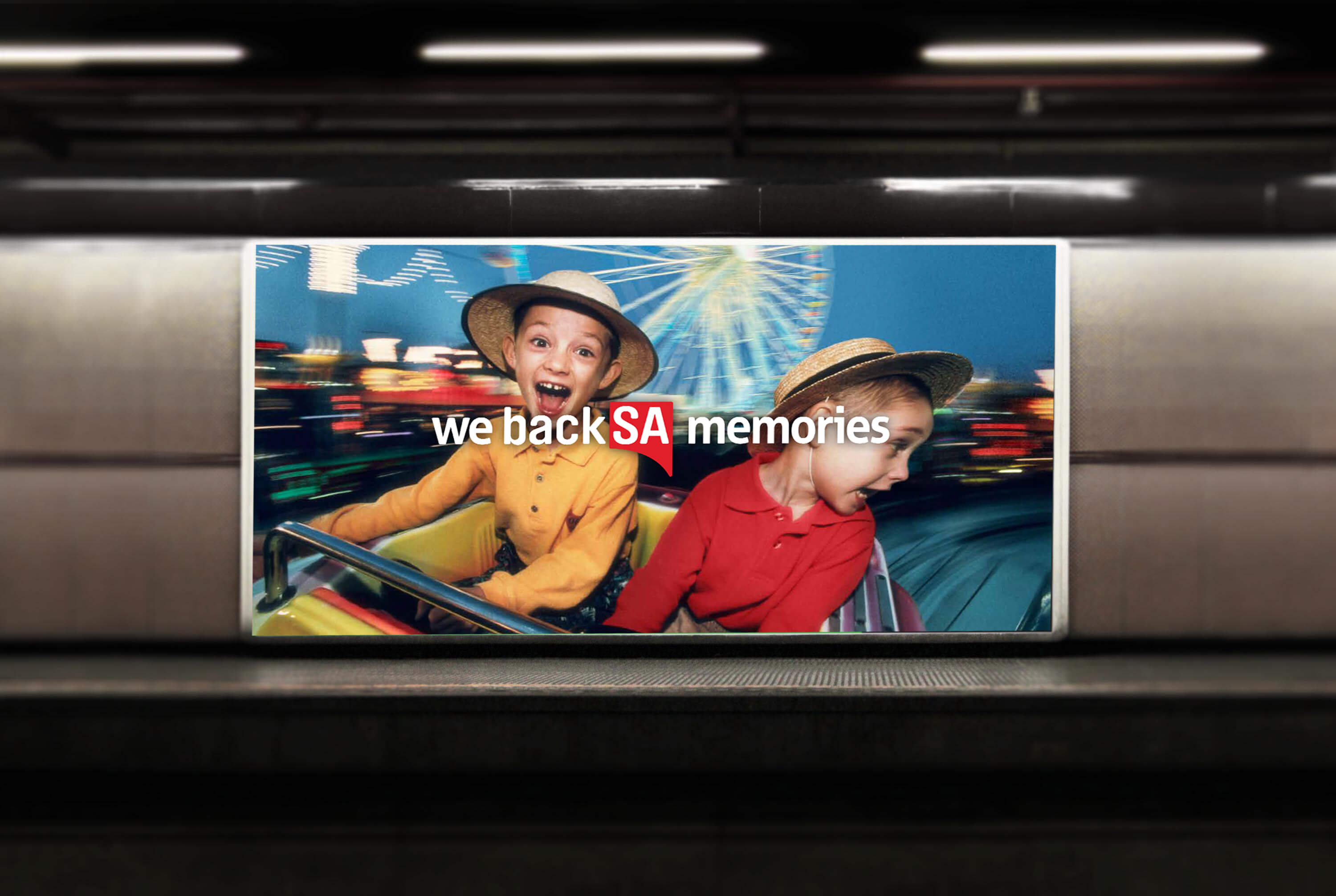
With our brand ambassador, Mr. Piping Shrike, I lead the design of the out-of-home campaign.
Agency: Saatchi & Saatchi
Role: Art Direction
Awards: Shortlist and Finalist New York Adveritsing Festival - Banks: Consumer - Retail
